
Tuesday, 29 March 2011
Wednesday, 23 March 2011
7. Looking back at your preliminary task, what do you feel you have learnt in the progression from it to the full product?

Throughout this whole practical process I think that I have gained and learnt alot of skills. The key skills that i have learnt have been using IT skills such as, Photoshop and publisher, working as a team and being able to manage my time efficently. The most important skill that I have gained has been using photoshop as I was not able to use it properly before, as you can see by the school magazine I created before. I learnt how to manipultate the pictures to fit my target audience which I found quite difficult as I'm not familiar with the target audience I chose. Furthermore, I had to research about my target audience (Indie/Rock) by going to steryotypical places like Camden. This allowed me to experience a different enviroment which helped me further myself as a media student. Learning to time magaging has been exceptionally important to me, as normally I find it difficult. However, I overcame this and kept to my target dates and deadlines which proved that I was able to use my time well. A disadvantage of time wasting was using photoshop, it took up a lot of time than I thought it would, which means I was able to work under pressure well. Finally, being able to work as a team member was a good experience as we were able to share all our ideas together and crete the same house style magazine.
Overall, making my magazine was an enjoyable process which helped me learn key skills which can help me now and in the future.
Tuesday, 22 March 2011
6. What have you learnt about technologies from the process of constructing this product?
When working and creating my magazine I learnt new skills on software such as photo-shop, Microsoft words, publisher and a friends professional camera. I then uploaded my work on an online blog site called bloger.

At the beginning I had difficulty using photo-shop, publisher or the professional camera, however over time I gradually learnt how to use the programmes and hardware.
I used my friends professional camera to take my original shots at Camden and Southbank.
I used my friends professional camera to take my original shots at Camden and Southbank.

I mostly used the school's computer to do most of my work, as I didn't have Photoshop on my laptop, which was quite difficult for me.
Other programmes I used were:

Facebook:
To get my target audience reaction of what they thought of my magazine, I received some comments on what people thought of my magazine but it was not as helpful as the video.

Flickr:
I used this programme to annotate my magazine however, it was difficult for me to use as I didn't know what to do.

I used this programme to edit the video's of people's reaction to my magazine and make it more presentable. It was fairly easy to use as it was straightforward.

Windows Publisher:
I used windows publisher to write up my musical article into columns. I did this as I wanted to not have any grammatical errors and give it a professional look, after then copied it into Photoshop.
Photoshop 7.01
Photoshop 7.01 was a programme that I used a lot, I used it to make my front cover, contents page and double page spread. I also used Photoshop to manipulate my original pictures for example cropping, colour boost or generally changing the pictures. An advantage of using Photoshop was that it made my magazine look professional and was easy to use when I knew how to use the programme. A disadvantage to Photoshop was that it was time consuming as I had to learn how to use everything from scratch.
Photoshop evidence:


Manipulation on Photoshop:
 This is evidence of how I have manipulated the photo's on Photoshop so I am able to change the pictures to fit the Indie genre.
Here I'm changing the title, as I didn't want the black background included in my magazine.
4. Who would be your audience for your media product?

I feel that my audience for my magazine would be people who are creative, have a different taste in music and their lifestyle and wanting to stand out from the rest of society. The age range for my magazine would be older teenagers from 16-20 years old. However, it may appeal more to females as the pictures I have used are mostly girls.

3. What kind of media institution might distribute your media product and why?
IPC Media:

After researching for an appropriate company to distribute my magazine. I found that IPC Media would be one of the best options. IPC Media is a huge company that distribute a wide range of magazine. For example they distribute 'LOOK' which is a fashion high street magazine and 'NME' which is a huge contrast as they are two complete genres. I think that there would be gap in the market for my magazine as it is completly different from 'NME'. They dont have a magazine which are targeted only for individual people.
Furthermore i have found out that IPC Media produces over 60 iconic media brands showing that it is huge company which will be good for my magazine as the recognition of IPC Media will attract my target audience more and make my magazine more popular. It would be better for me to use a big company as I think if I chose an independent/smaller company. It would not get a lot of advertisement and people may tend not to buy my magazine.
I feel that the price for my magazine is a reasonable price (£2.50) as my target audience would not buy a magazine over the cost of my price.

Beuer would be another magazine company I would consider to distribute my magazine to as they distribute other magazine which is similar to my genre such as 'KERRANG!' and 'Q'. They also own more than eighty influential media brands like IPC which again shows there wide varieties and interests. They publish magazine such as, GRAZIA, Closer, MATCH, Magic 105.4, Kiss 100, Kerrang!, Q and many more. However, i feel that they would be too much competition within this company which could lead to my magazine not being popular enough.
2. How does your media product represent particular social groups?
Here I have an original picture I took myself and two pictures from a magazine:


My magazine is targeted at people who have individual traits and dress/follow the indie scene. They are normally interested into indie/rock or alternative music like the girls above. The pictures above show that all the girls are wearing similar costumes and have the same natural look to there hair.
The background of the pictures are minimal focusing more on people who are in the picture. All the girls are wearing barely any make-up showing that indie girls in general don't perceive make-up to be important. There facial expressions are natural and not posing at the camera this suggest that the picture in general is natural and laid back as there is not a lot going on within the pictures.
The background of the pictures are minimal focusing more on people who are in the picture. All the girls are wearing barely any make-up showing that indie girls in general don't perceive make-up to be important. There facial expressions are natural and not posing at the camera this suggest that the picture in general is natural and laid back as there is not a lot going on within the pictures.
All the pictures are medium shots, which allows us to focus more on the girls and their pose than the background.
Steriotypically, young Indie/Rock teenagers are percived in a negative way. They are normally associated with alchol, drugs, 'Rock and Roll' and partying. However, I have represented the young adults in a positive view, for example, the girl in my front page is seen to be thinking which suggest that they are thoughtful, confident and genuine.
Overall I think that these elements on the photos represent a normal young indie/social group and that my magazine reflects this throughout. You can see by looking at the pictures that these girl dont represent a 'Rock' or 'Hip-hop' genre but an Indie genre. However, I think the pictures would attract a mature audience instead of young teens by the way the pictures have been taken.
Monday, 21 March 2011
1. In what ways does your media products use, develop or challenge forms and conventions of real media products?
In creating my magazine I researched other front cover, contents page and double page spread. Researching other published magazine helped me become aware of the conventions that are used in magazines. I used a majority of these conventions but challenged some conventions. I looked in close detail of other Indi genres. I found out that there were mimunal features on the front cover. They mostly focused on the person who was on the front cover or focused on the colours used. One of the magazines that I was inspired by was ‘Indie’. I thought that they captured the genre appropriately for the target audience. However, I changed several conventions throughout the front page, contents page and double page spread.
Front Cover:
When creating my front cover I wanted to attract my targeted audience, which were people who are interested in the indie/rock genre. I wanted my magazine to be similar to other indie/rock magazines.
However I didn’t want the layout to be too busy or to simplistic for example ‘NME’ layout is
really busy although the magazine ‘Indie’ has a simplistic layout.
really busy although the magazine ‘Indie’ has a simplistic layout.
 |
| simplistic layout |
 |
| busy layout |
This allowed me to add my own individual touch to it, as I was thinking about the target audience. The first step was to add a background picture. I researched the kind of clothes that an indie/rock person would wear, which is shown appropriately in the front cover. The girl in my front cover is wearing appropriate ‘Indie’ clothes, which will help me attract my target audience. Other magazines such as ‘KERRANG!’ and ‘NME’ have the artist/main feature wearing suitable clothes, which represent the genre and attract the target audience.

I then edited and manipulated the background picture in Photoshop. I decided to darken the picture slightly but add colour boost in some areas so that it would have an indie/rock feel to it.
Original picture:

After picture:

As you can see I have manipulated and cropped the picture. So that it would look different and fit my indie/rock genre. I edited this picture in photoshop and added colour boost so it would look indie, the picture would be more interesting and would appeal to my target audience.
I looked at and picked several mastheads’s to use but I felt that this one would be the best one for my magazine.
 |
I wanted my masthead to stand out and catch the audience’s eye however I didn’t want it to look to ‘rocky’ like the ‘KERRANG!’ masthead below as I thought it would change the genre of my magazine.
I chose a simple colour (white), as I wanted to keep it neutral and have an indie/ style towards it. However I challenged the ‘stereotypical’ conventions as I tilted the masthead and placed it at the side of the page. I did this on purpose; as I wanted to make sure that my magazine was different to other magazines. I thought that this would appeal and attract my niche audience, as it looks different. At first I did think to place my masthead on the right hand side of the magazine but was not able to as if it was distributed in the shops my target audience would not be able to see the title and therefore, would not be convenient.
The colour scheme on my front page is suitable for the indie/rock genre as it is quite simple but dark. I didn’t want my magazine to have a more ‘rocky’ look to it so I decided to outline a lot of the words and add a touch of rainbow colours on my tagline (‘Bringing Indie to you’), I felt that this would be an indie thing to do. I added two pictures on my magazine, as I didn’t want it to look too boring for my audience. The pictures relate to the features within the magazine and have taglines/captions underneath telling you what they are, which are included in other professional magazines.
Contents page:

The layout of my contents page is quite simple and similar to other contents pages. I didn’t want to have such a busy and complicated contents page as I thought that it would be too much for my target audience. I thought that a simple layout with the article features on the right and pictures on the left would be appropriate. I have followed the conventions of normal contents pages. As I have the title at the top of the page. I then have ‘This month’ at the side of it showing that it is a monthly magazine. Normally magazines are distributed weekly for example ‘NME’. However I thought that it would fit my niche audience better if it were a monthly magazine. I wanted to use the same colour schemes on the contents page to make it look consistence and fluid, which gave my magazine a more professional look. I kept the font the same throughout but highlighted the article names as I was showing they were important and added what the features were with a caption underneath it. I saw that most magazines did this, giving my contents page a more professional look.
I wanted to make sure that the pictures on the right fitted with the indie/rock genre. The pictures were all different mise-en-scene, angles, lighting and sizes. This added a more different look to my contents page and gave it a more professional look as other contents page do not have the same styled pictures. There is one picture, which stands out and challenges the conventions. The camera is tilted upwards and makes it looks as though the girl is looking down at you. I included this picture as I felt that it was completely different approach which would attract my target audience.
The language used is appropriate and shows that it is a music magazine. I used words such as ‘ready to rock’ and ‘upcoming tours/gigs’ to show that it was an indie/rock magazine and not a hip hop/R&B music magazine.
The contents pages I researched and looked at were:
I have looked and included some features from both of the contents pages.


Double page spread:
The double page spread is a bit different from other magazine double page spread. I looked at other double page spread’s and saw that the mainly had the pictures on one side and the text on the other for example NME double page spread:

So I decided, I didn’t want to have a picture on the left hand side and just text on the right. I kept the title and sub text where it would stereotypically be making sure that I kept most of the conventions and made sure it stayed/looked professional. I kept the title 'AMERICA'S MOVE TO ENGLAND' the same font on how it was on the front cover adding constancy to it. I overlapped and decreased the size of the text, as I wanted to add a sophisticated but different look to it. I kept the majority of the magazine an interview, as I wanted the main feature to be focused on her, as it was her big move to England.
The colour’s used are mainly red and black showing clearly who was the interview and the person being interviewed and kept my font the same as the font in the contents page.
There are quotes around the double page spread, which are in a different font giving a more edgy style to my magazine.
The photo I have used has been taken from a different angle challenging the normal conventions. I think this has worked, as the audience I am aiming it at will find it more interesting. I have added ‘words by’ and ‘image by’ on the corner of the picture to make it look/feel more professional.
The bar at the top with ‘exclusive interview’ empathises that it is the main article and this has been done in several other magazines. Furthermore, this also relates to the whole music magazine. There is also concert dates when ‘America’ is on tour again adding to the music genre.
Double page spread I looked/compared at:


 The two double page spreads helped me think how I wanted my layout to be like. The pictures on all three double page spreads are not on the left hand side but are more on the right hand side or in the middle. At first I was worried if the picture would look right being centred in the middle as I was afraid that the picture would look distorted and strange but it worked well with the layout.
Thursday, 17 March 2011


Wednesday, 9 March 2011
Editing pictures on photoshop. (Double page spread)
BEFORE:

AFTER:


AFTER:
The image above i have cropped so that the pictures is focused more on the person. I then editied the colour to add an effect of indie style.
AVATER
Notes on Avater:
- Shown in 3D (break through in 3D films)
- Critically aclaimed
- Uses special effect/special camera
- Fantasy/ Science fiction genre
- Director = James Cameron (James Cameron had the idea to create a film like Avater for 15 years)
- Auteur Theory = Director (well known)
- Highest grossing film
Production team:
- 2oth century fox films
- Dune Entertainment
- Lighstorm Entertainment
- Ingenious film partners
- Giant Studios
Making AVATER:
- James Cameron was a CEO (boss) of a visual effect company
- Dreamed of making Avater his whole life
- Brother Termiate (performance capture, practising for Avater, 2001)
- Avater written in 1995
- 2oth centuary fox, big production (funded Avater)
- Director wanted the audience to "be an avater"
- Setting based on real settings around the world, for example China
- Director was being scienctifically accurate
- Wanted the audience to learn while watching the film
- Risk factor in production, WETA waited for Avater to finish
- Gone from having a minimulistic set to building the sets and having live scenes/action (costing money to build replicas of the set)
- "Almost 2 films diffrently made" said one of the actors. (CGI+human)
- Character learning how to fly helicopters
- Been developing a 3D camera since Terminator. (Fusion camera's used. Shoots actors live in 3D)
- 3D would of seen in post-production but they can see it straight after the scene they had just shoot.
- Pro's and Con's t live actiob and CGI
- Monitor camera see's all reference camera's so they can see what shots and angles would be better.
- Send rough cuts to WETA= CGI makers
- Studying animals for facial captures such as lions
- Over a year for them to animate a small section, Feb 2007-May 2008. 10-11 shots
- 26,000 shots over all
- Cutted out 40 mins of the film, they didnt want the film to be long.
- Need starr appeal for the film to be recognised well
- SIGOURNY WEAVER = Star of Avater
- Jan 2007 film made finally
- Got an lingustic to come in and create a whole new language for the flm.
- Method acting = alot of money. Achery,Dance and movement coach needed to help the actors
- Refrence camera and Virtual camera used
- Inifivity tech
- Virtual camera brings the CGI and acting together
- Refrence camera = back up camera
- changing the way films and CGI is used
Production,Distribution, Marketting and Exhibition:
- Production: Making films e.g 20th centurary fox, studio
- Money!
- Need green light
Distribution :
- 20th fox normally distrubute their own film
- Smaller production studios would need someone to distribute their film. They might even get a larger known comopany to distrubute their film as people would tend to watch it more.
Marketting and Exhibition:
- Trailers and things to advertise their movie.
Monday, 7 March 2011
Draft Contents Page

As you can see above this is my (draft) contents page. I have followed the conventions of other magazines. I have included features and articals that relate to music and my chosen genre. I have kept the colour netural as it is amied at males and females so i didnt want to influence the audience. I have decided to make my magazine monthly and cropped, manipulated the pictures to fit the Indie genre.
Thursday, 3 March 2011
Draft Front Cover for Magazine

This is my draft front page. I have followed the conventions of a music magazine. The colour used suits the indie genre. The picture also fits the indie genre.
Tuesday, 1 March 2011
Original pictures
Location
We decided as a group that the best location would be in Camden and South bank (in Waterloo). We picked these location as we felt that it would be a right location to use for our photo's as it fits the genre of Indie rock.


Getting ready
These pictures show evidence of our group getting ready for the photo's. We had to change the style of make-up that we wear and our costumes to fit the indie genre we were aiming for.


Original shots
Finally, this is our final shots that we took as a group in our chosen location. As you can see we looked closely at the mise-en-scene, lighting and shot type. We took a mojority of medium shots as thats what we needed for our front page. We then took different variety of shots from high angle and low angle as we wanted our magazine pictures to have a different look to it than other magazines.


We decided as a group that the best location would be in Camden and South bank (in Waterloo). We picked these location as we felt that it would be a right location to use for our photo's as it fits the genre of Indie rock.


Getting ready
These pictures show evidence of our group getting ready for the photo's. We had to change the style of make-up that we wear and our costumes to fit the indie genre we were aiming for.


 |
Original shots
Finally, this is our final shots that we took as a group in our chosen location. As you can see we looked closely at the mise-en-scene, lighting and shot type. We took a mojority of medium shots as thats what we needed for our front page. We then took different variety of shots from high angle and low angle as we wanted our magazine pictures to have a different look to it than other magazines.


This picture has been taken from a low angle to give it a different look as the audience would be more intrested. However the lighting is not effective in this picture as it is too dark to fit the indie genre.
The facial expression on my friend is also not suitable  for the indie genre.
 for the indie genre.
This picture is a good example to put in my magazine as the mise-en-scene is correct for the indie magazine.
My friend is wearing the correct costume as it fits the indie genre. Her make-up also fits with the indie genre as it's normally bright. The lighting is effective in this shot as we can see her properly.


The picture above is a great example to fit an indie magazine. It looks vintage, different and relates to music. The mise-en-scene is appropiate for the magazine as its in a record store. The pictures isn't really posed as there are people around my friend. The picture has also been edited showing i can manipultae and crop pictures. 


The reflection in this picture is unique as posed pictures are normally by a blank background. The reflection adds an edge to the picture. Once again my friend is wearing clothes that represent an indie genre. For example the scarf around her neck. The lighting is effective in this picture, it brightens up the picture. I have also manipulated this picture to sharpen and make my friend more focused in the picture. 

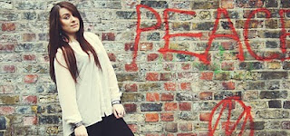
This picture above is diffrent to the others as the background is plain. My friend is centered in the picture so you can only focus on her. This picture is very effective as it would suit an indie magazine which will have miminum features. The costume here is netural, again fitting with the indie genre. 


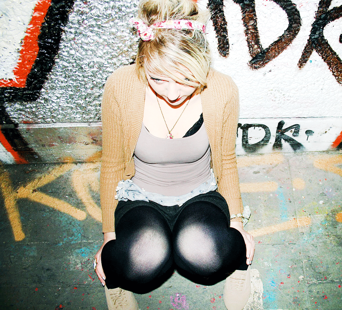
This picture is taken from a high angle shot. It shows the varitey of our pictures and how we have tried different shots to suit the indie genre. The significant prop in this picture is the headphones, which show that the picture fits the music genre. I'm also wearing a flower in my hair suiting showing an individual/differnet look.

Again using the headphones to link the picture back to music genre. 


We have re-created the 'famous beatles poster' as it is a significant poster/album picture, within the music industry. This shows how we have looked and researched the type of audience/genre were going for.


Subscribe to:
Comments (Atom)